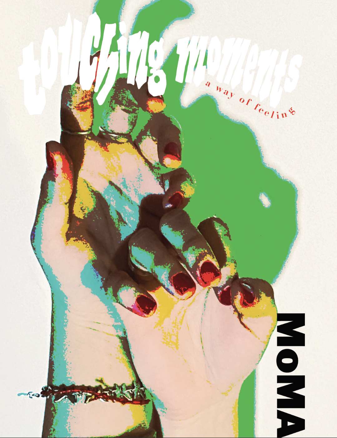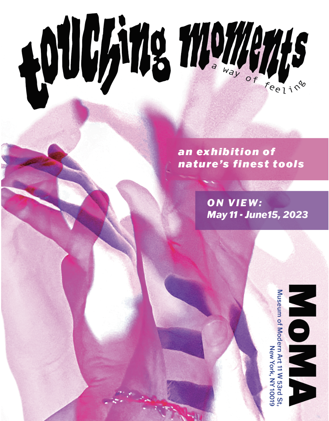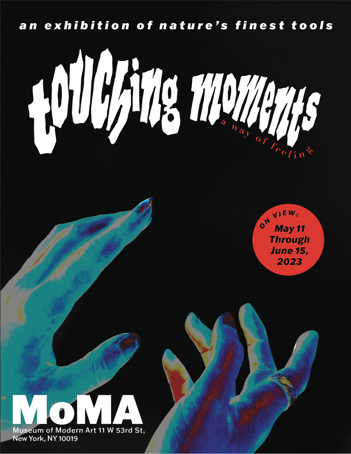

The assignment was to create a poster, brochure, and digital screens presenting an art collection utilizing photographic, illustrative, and typographical representation. For the design I drew inspiration from horror and crime movie posters from the 1970s. Elements from this era of graphic design I was drawn to were the posterization effect with colorful shading, and the juxtaposition of red with black and white photography.
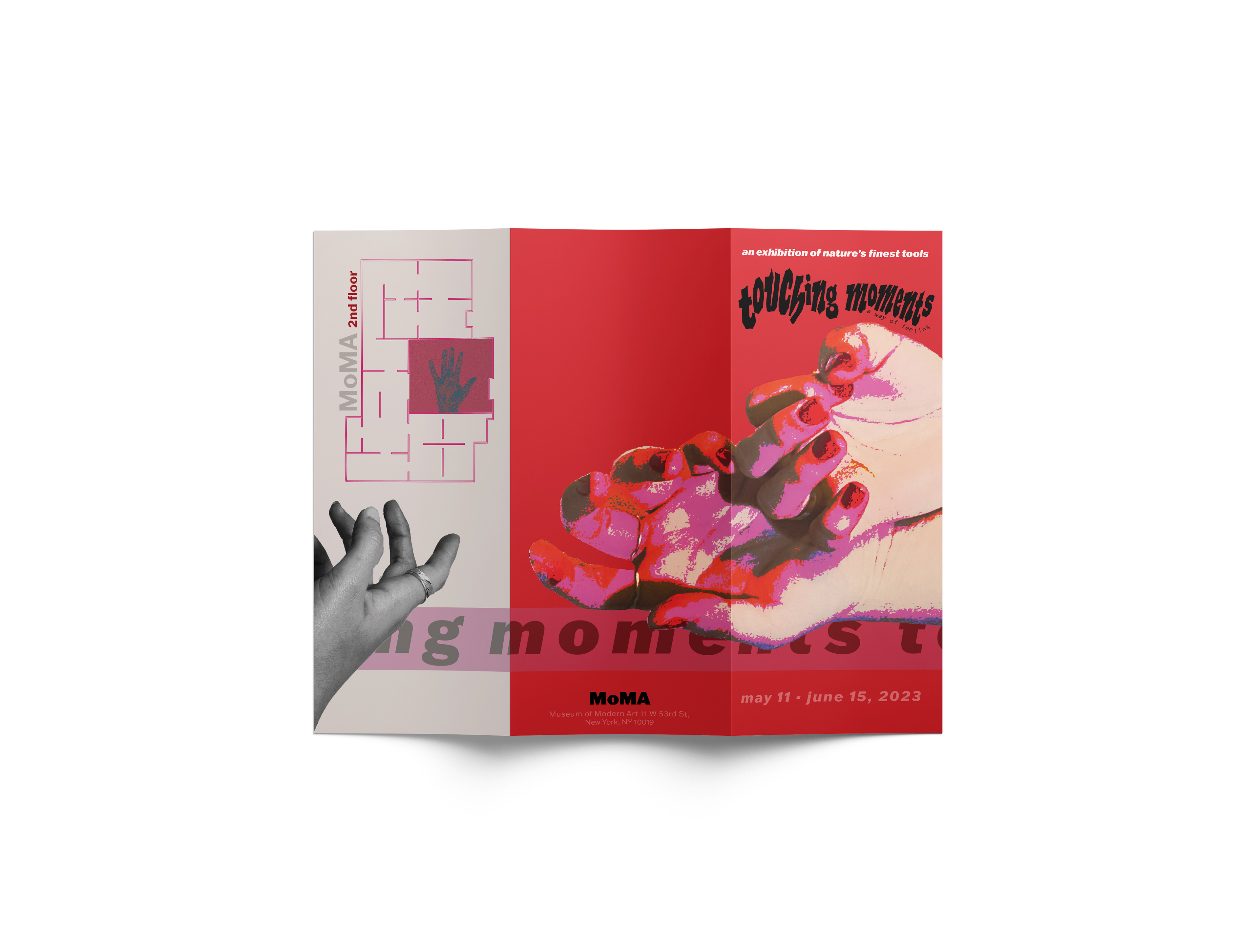
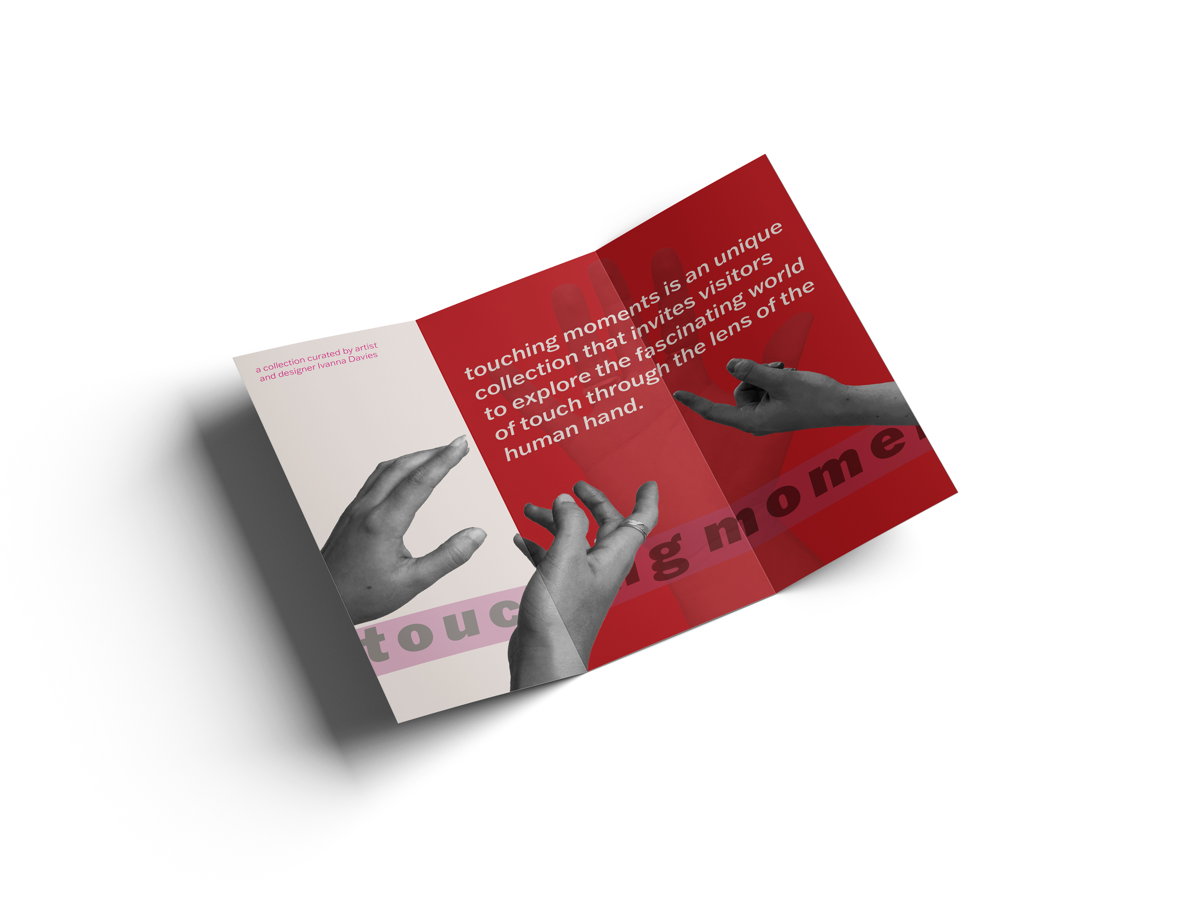
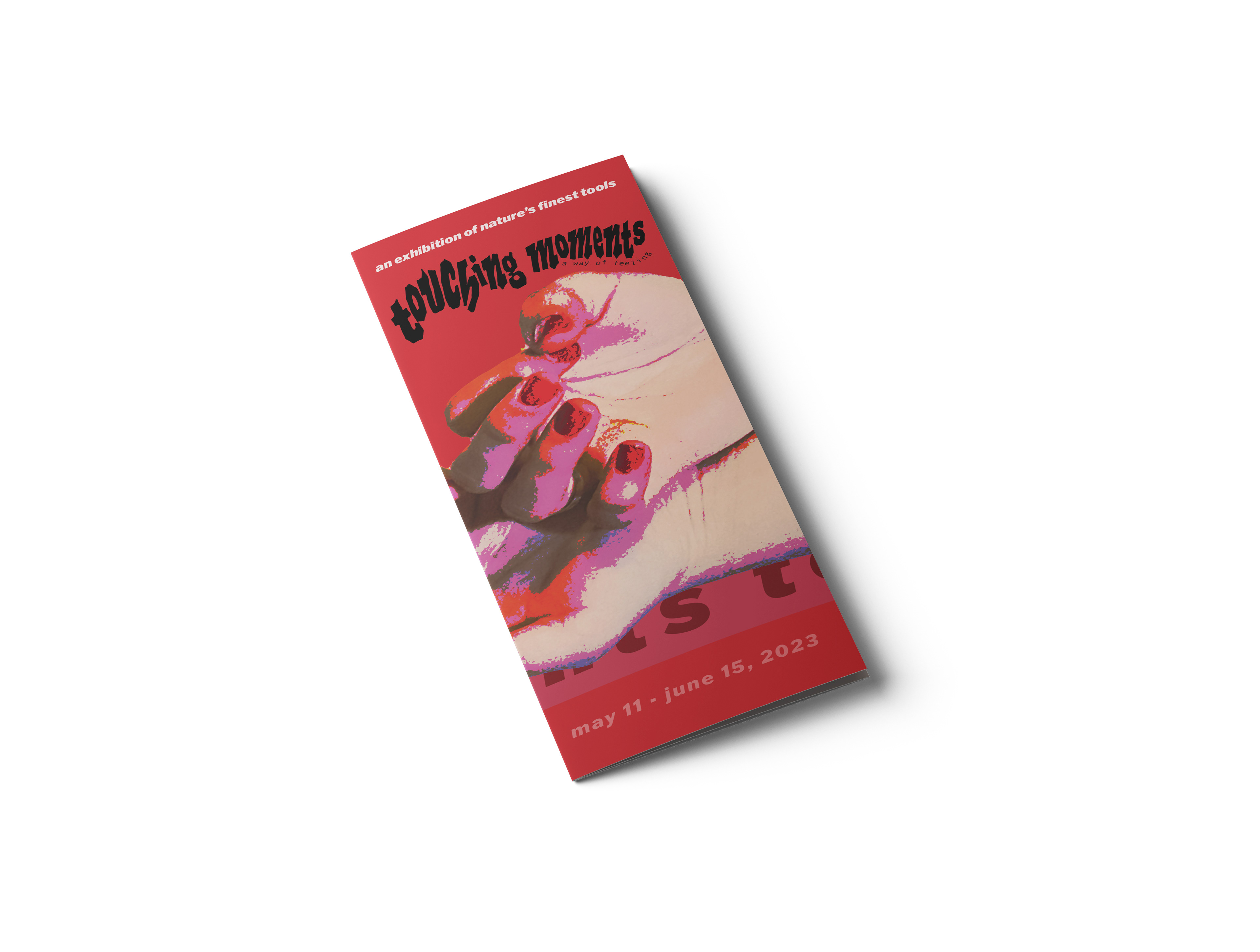
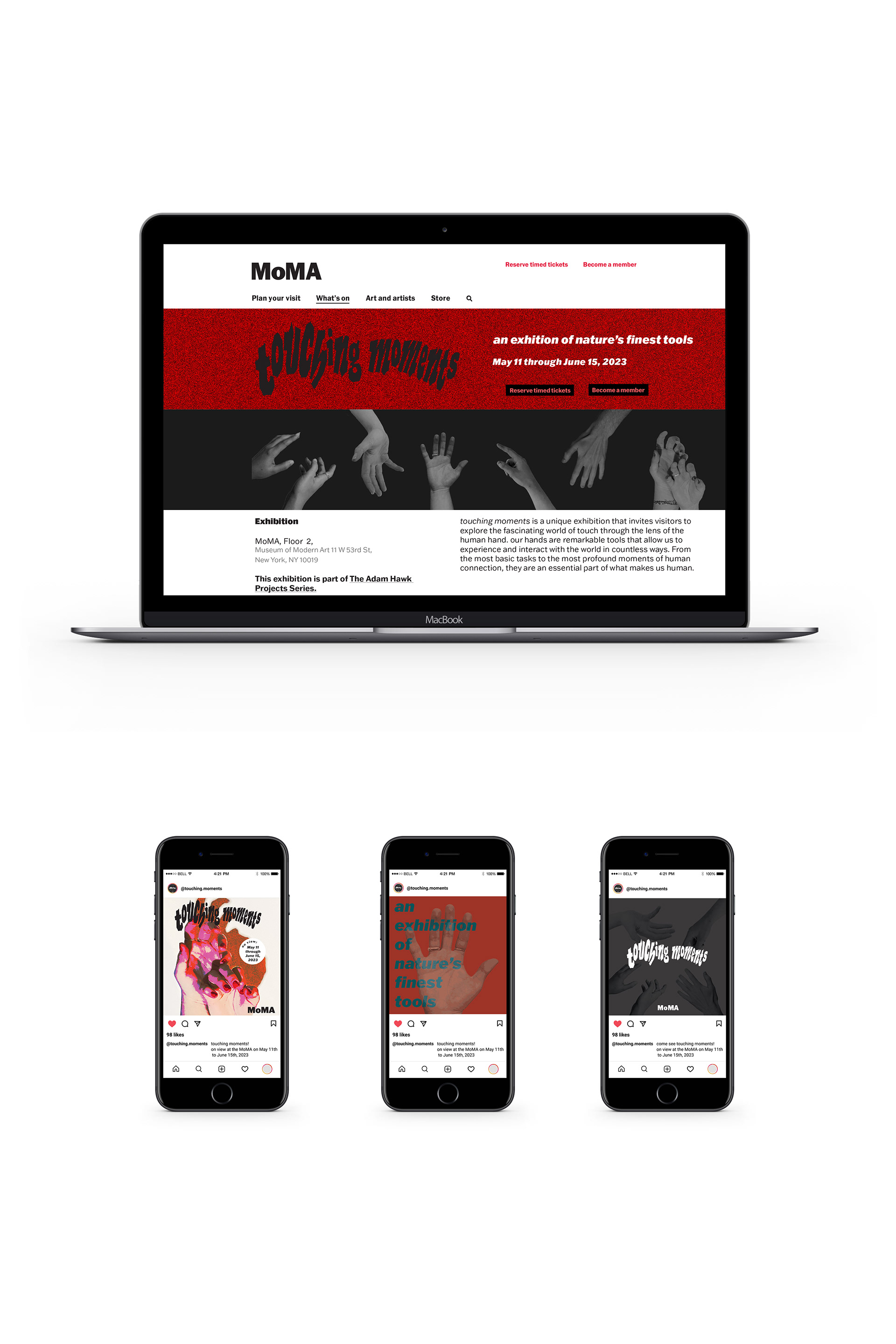

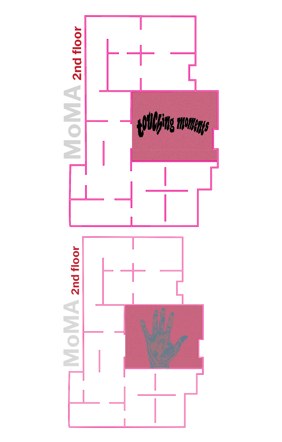
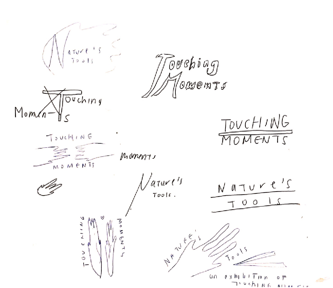
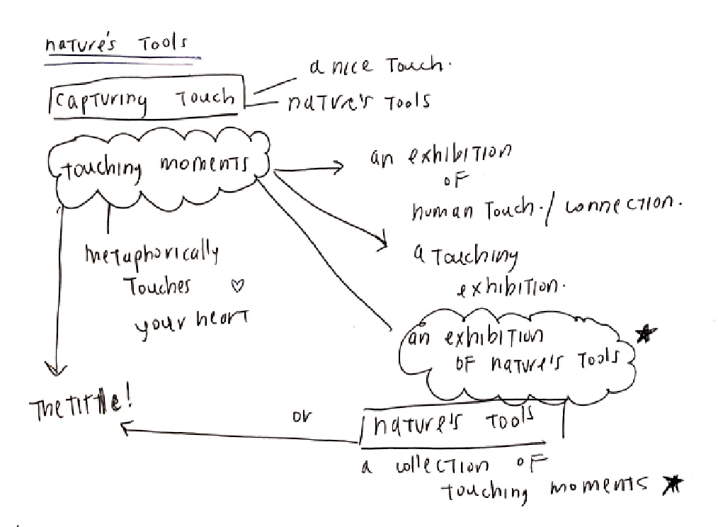
Brainstorming on the conceptual direction I wanted this project to go, I came up with the phrases “touching moments” and “nature’s finest tools”. “Touching Moments” was used as the title of my exhibition, playing on the double meaning of the word ‘touch’ and referencing photography as the medium of the collection. The concept of hands as tools finely tuned by evolution and individual training came to be a theme that was meant to shift the viewer’s perspective on the content of the exhibit.
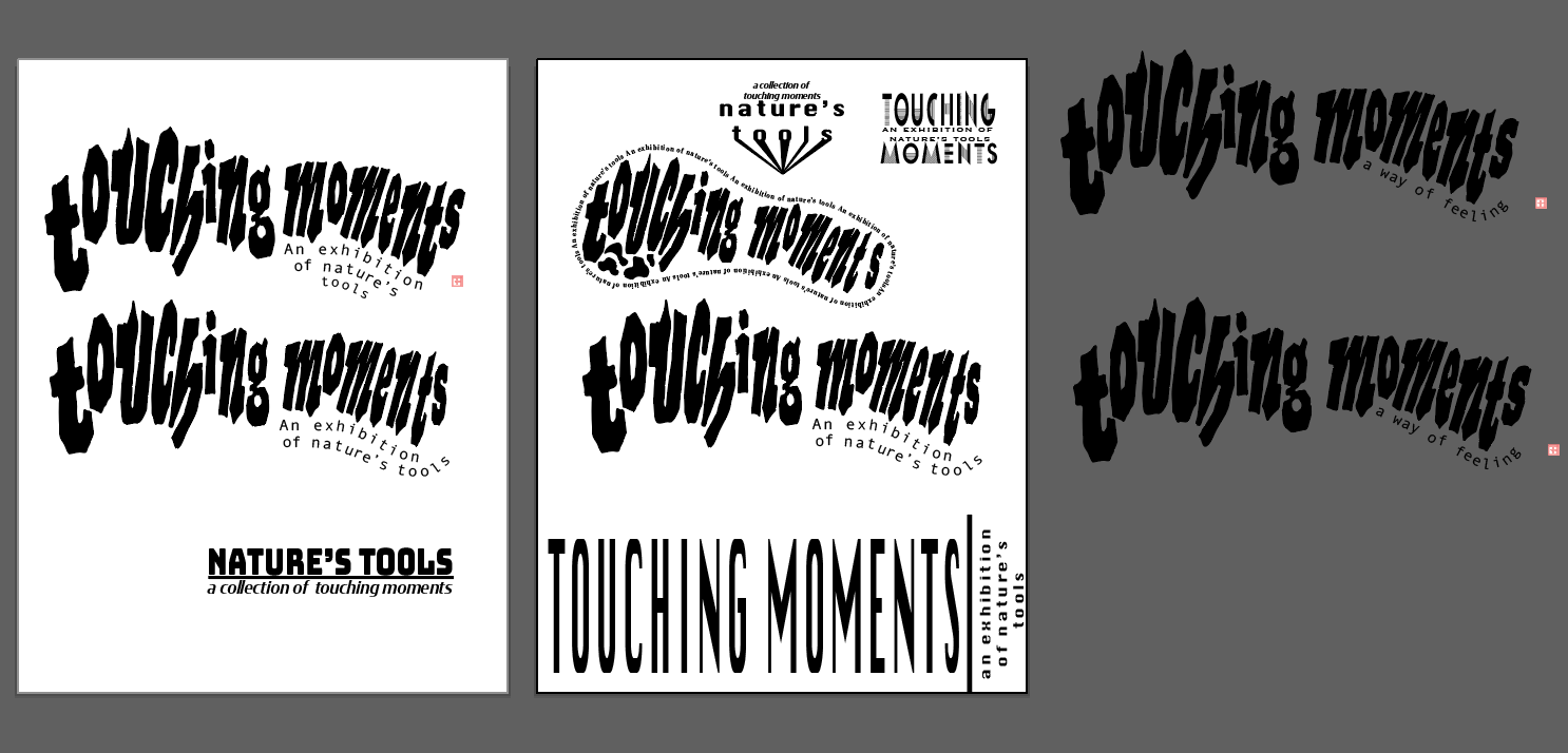
MY PROCESS