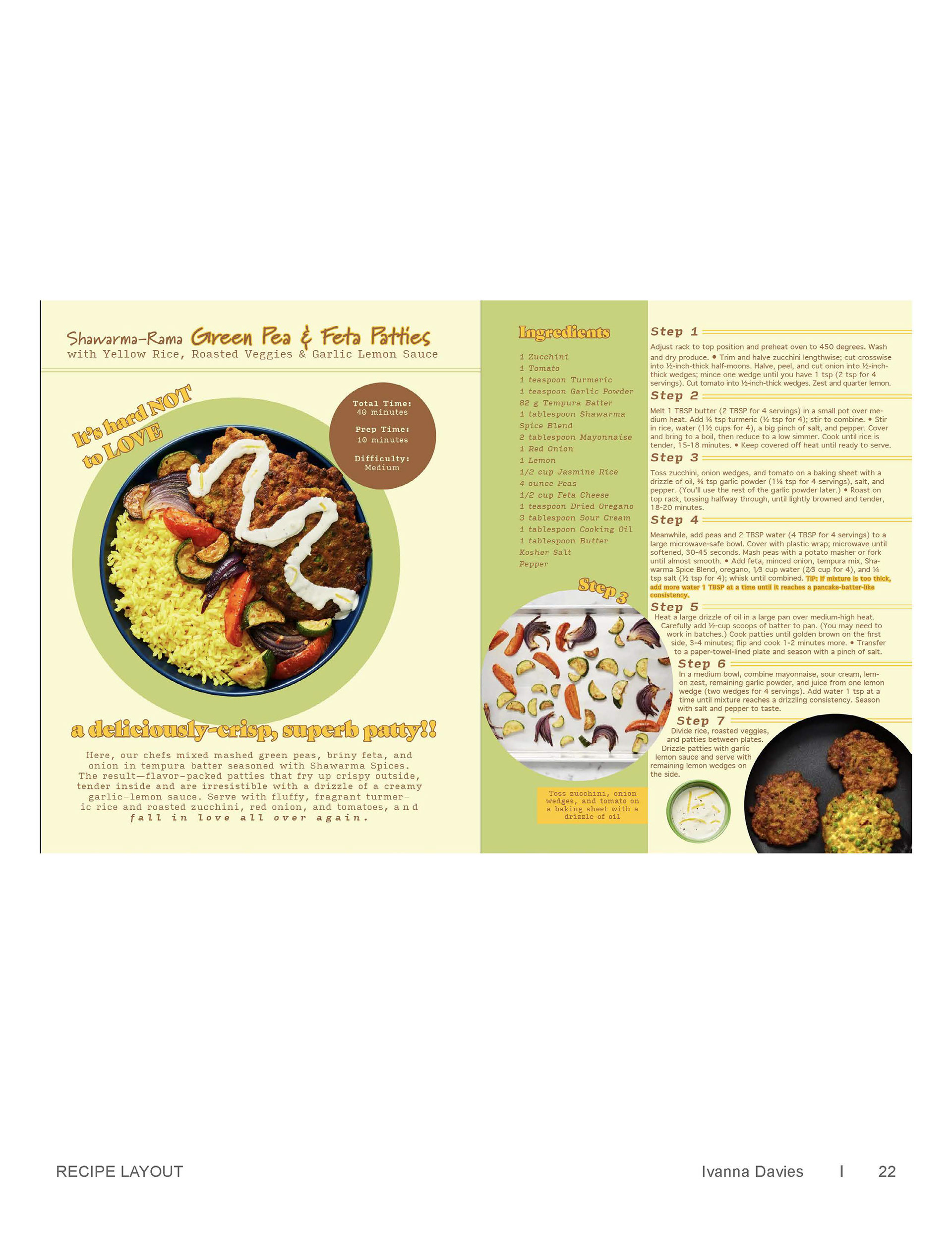
For this project, I was provided two recipes and asked to make a cookbook spread for each. Both printable and web versions of the spreads were requested.

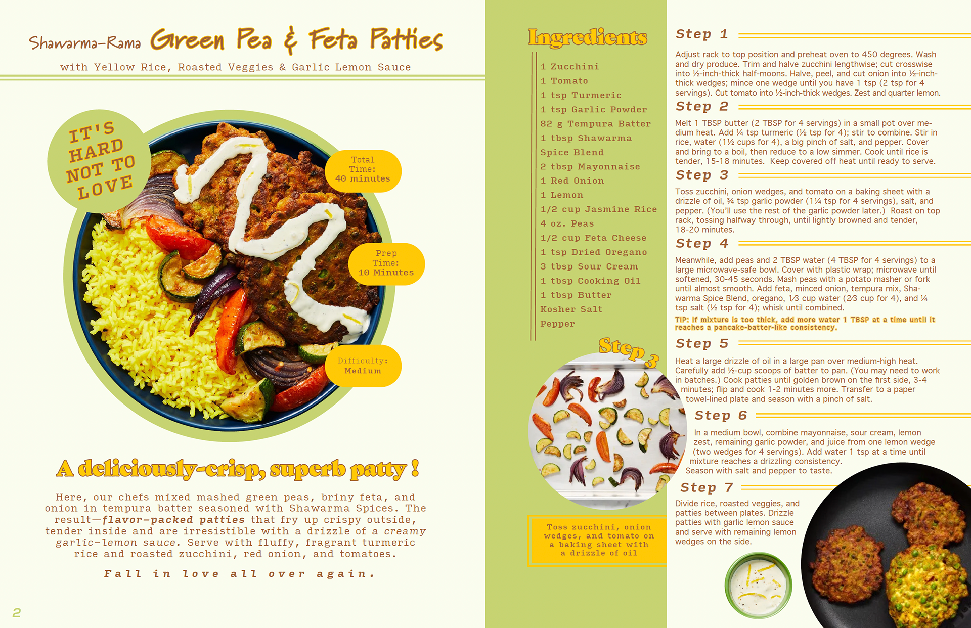
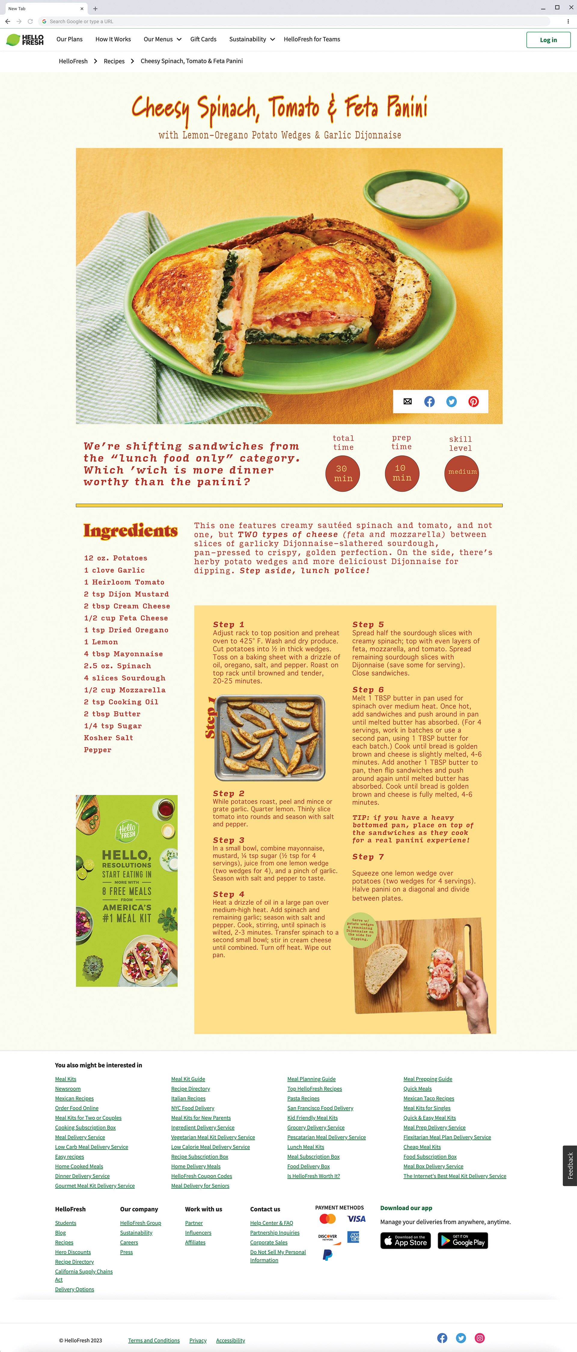
I focused on curating a visual experience for the reader that is easy to follow and keeps the dish as the star of the page. I formatted the pages to have a clear sense of hierarchy. I limited distractions by tastefully using companion images to highlight ingredients while leaving the recipe text and ingredient lists predominant and legible. These spreads provide a clear list of ingredients and steps while engaging the reader and accenting the dish with creative design elements specific to each recipe.
MY PROCESS